HL Lovely Creations
BRAND IDENTITY + WEBSITE DESIGN
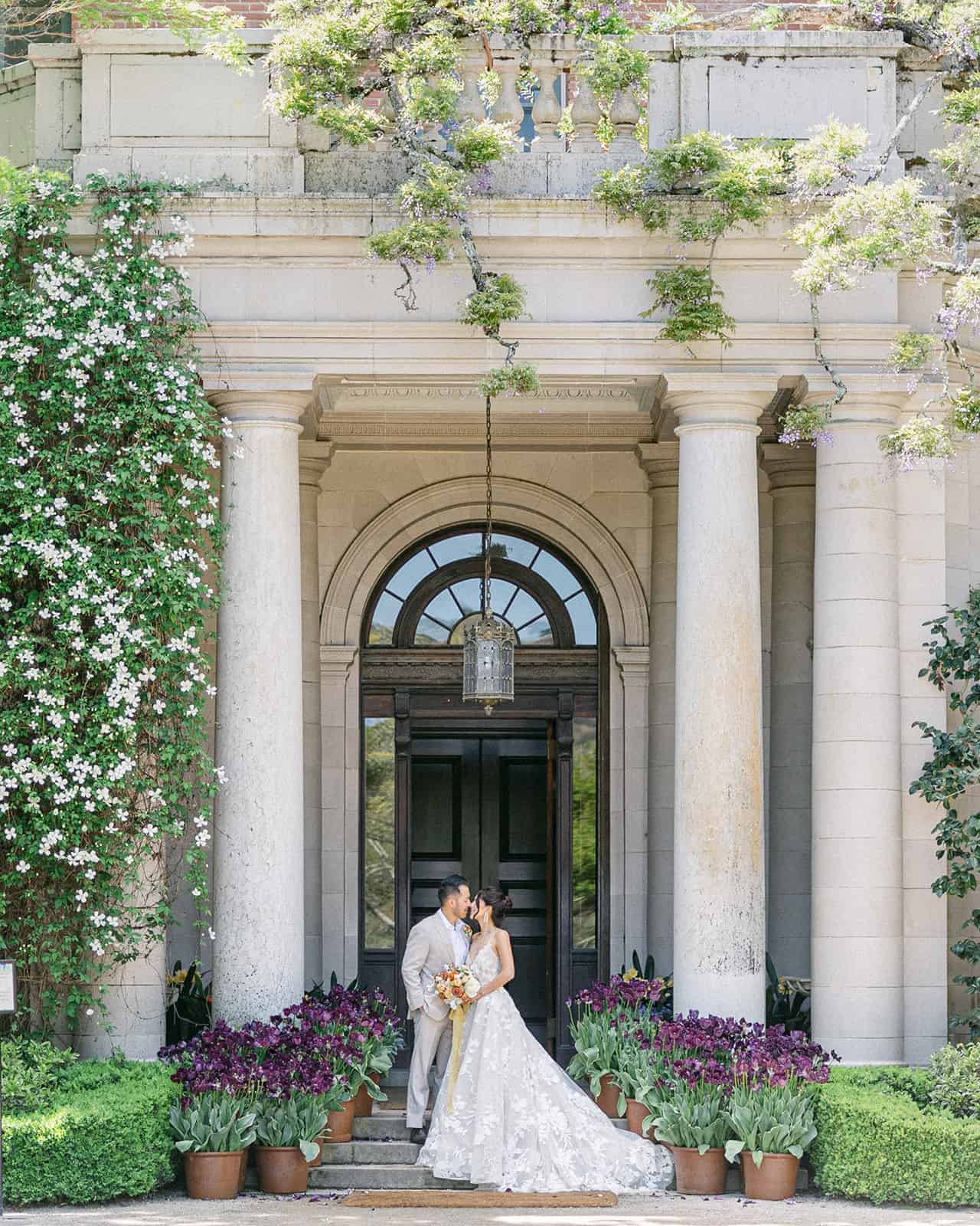
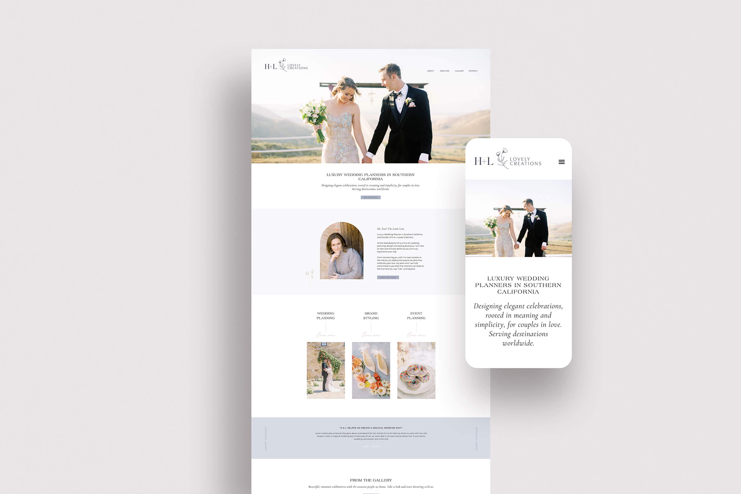
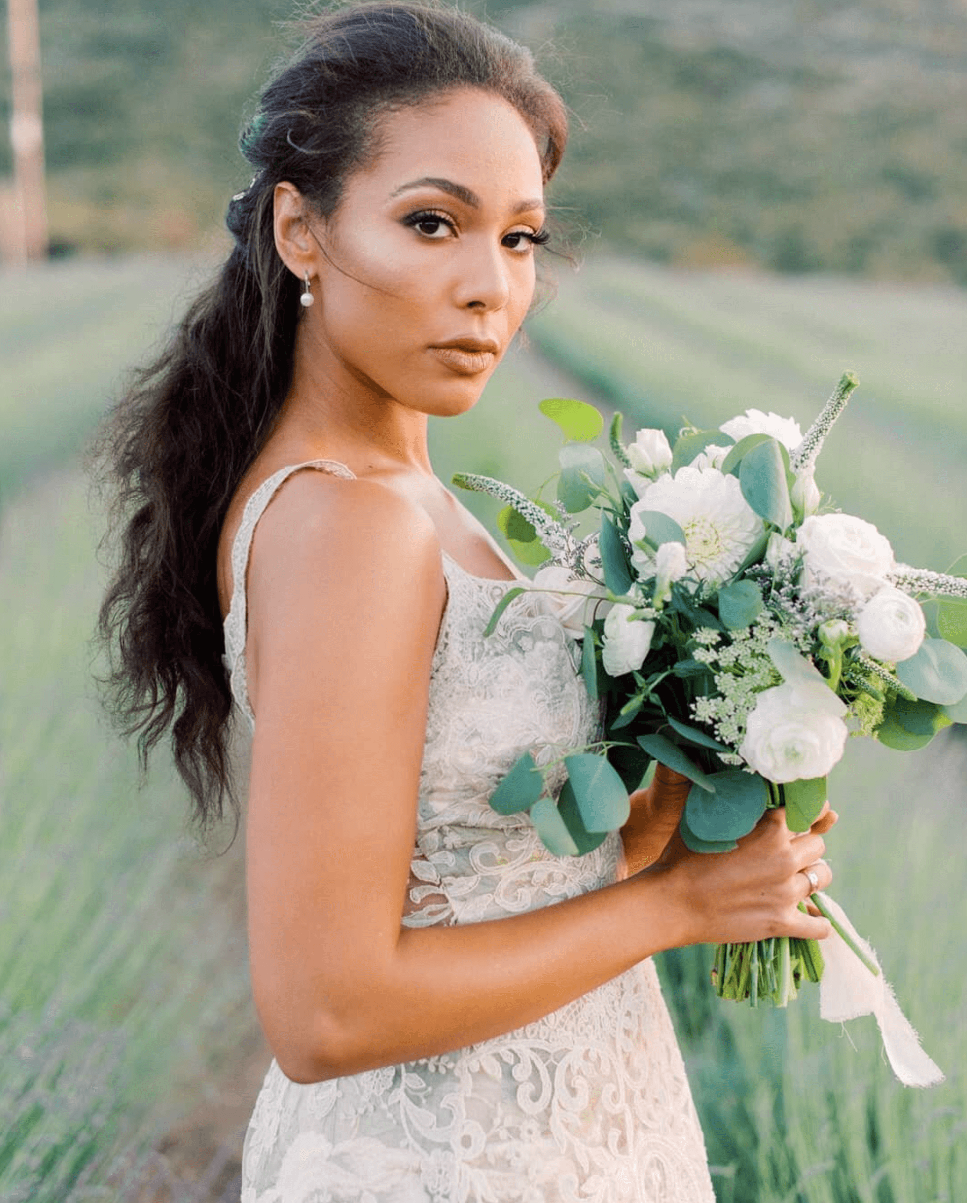
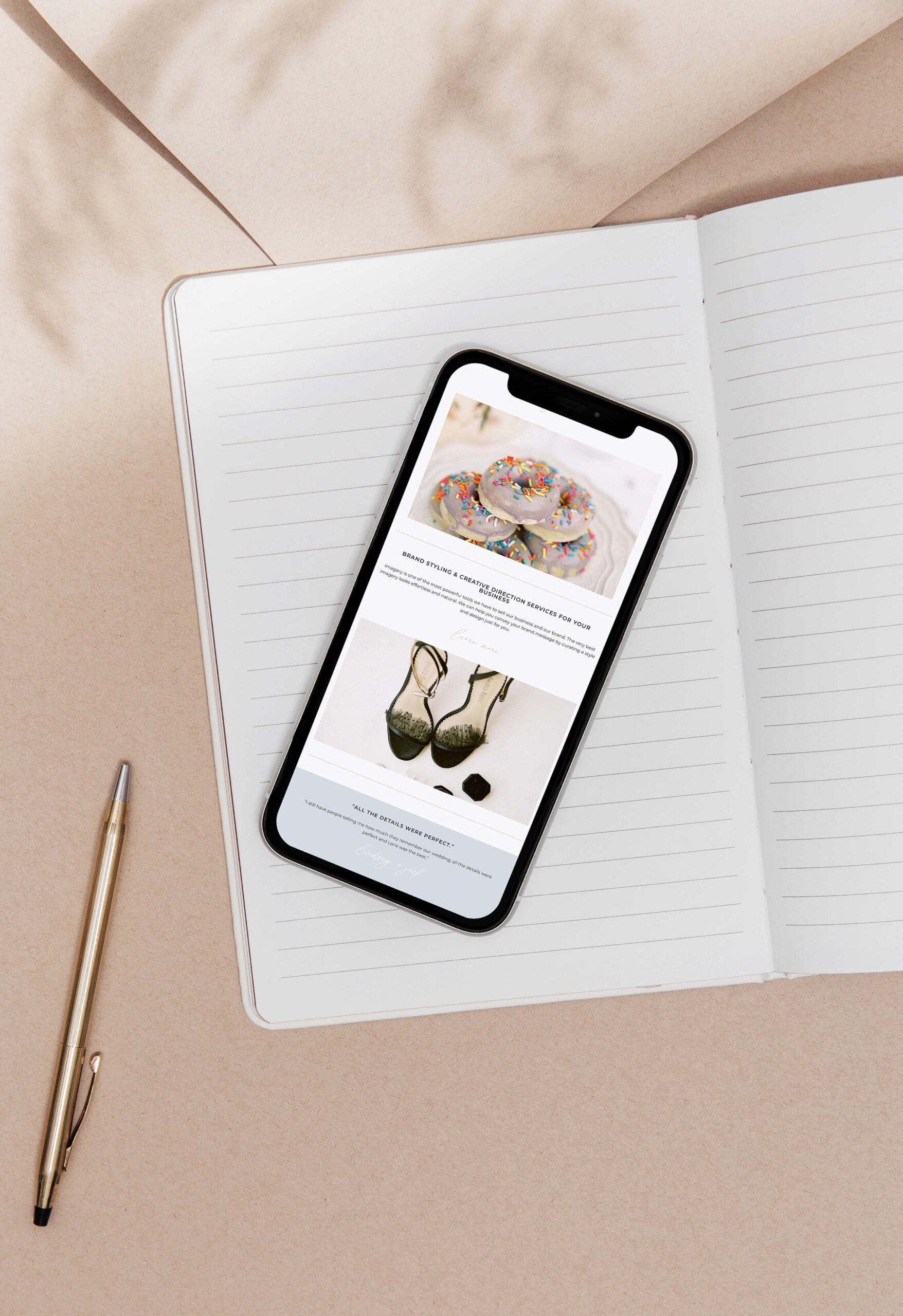
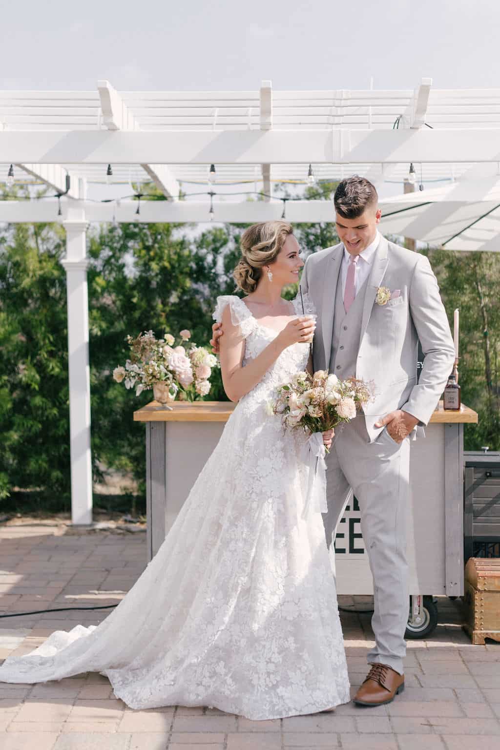
H & L Lovely Creations creates and plans beautiful bespoke weddings tailored to each couple, with every detail carefully thought of. Their weddings look amazing and so beautiful however their existing logo wasn’t sitting in the same space. I knew they needed a brand with heart and soul and that could sit along side all these beautiful images while also elevating them into that luxury space.
sophisticated + elegant + refined + romantic
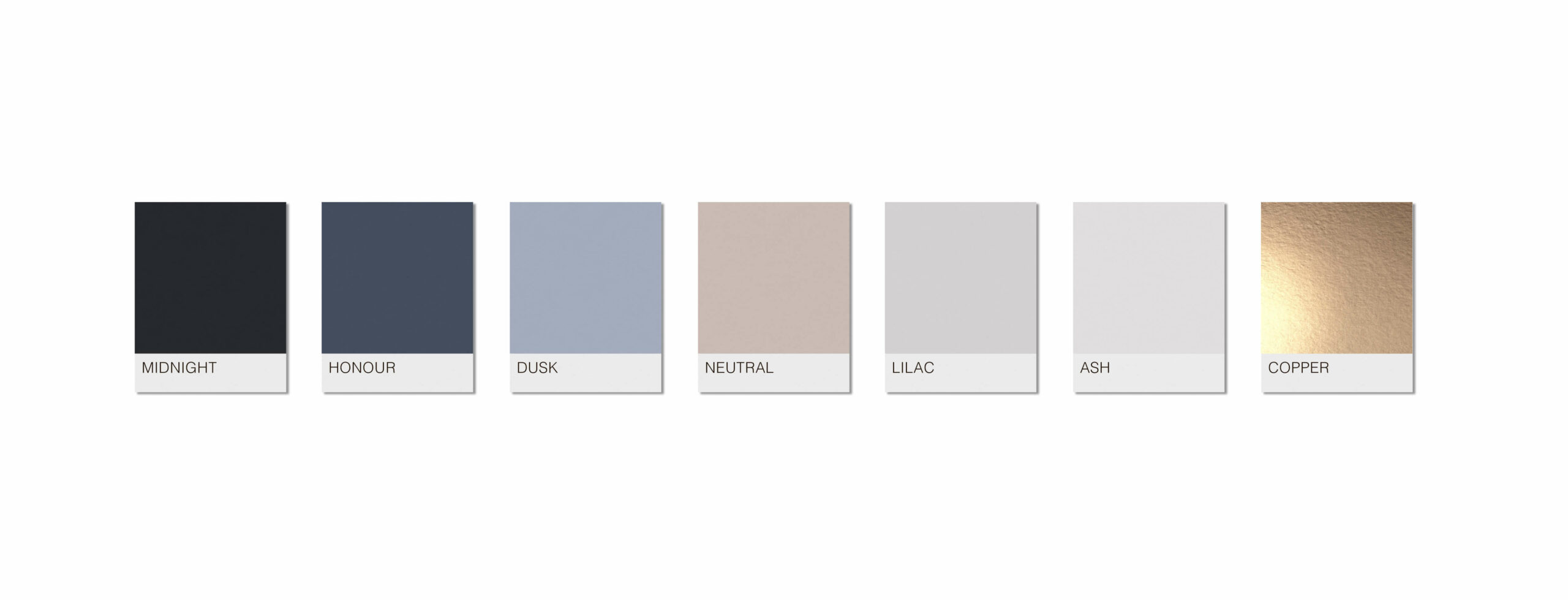
COLOUR PSYCHOLOGY
I absolutely loved doing a deep dive into HL Lovely Creations business and getting a sense of their business essence. With attributes such as attention to detail, beautiful, creative, elegant, gentle, graceful, quality, romantic and timeless this places them in a Summer season (colour psychology). With the Winter season coming in second with attributes such as expensive and high end.
I haven’t used a solid black as I think it would be too harsh and unfriendly, when your weddings have such a beautiful depth and richness to them. Instead I have used trusting blues with a touch of mauve to them and some romantic neutrals that aren’t too pink, with a dark midnight to provide contrast when impact is needed. The copper brings in some added extra special detail and a more expensive look while also contributing to a warm artisan style.
CREATIVE STRATEGY
SOPHISTICATED + ELEGANT
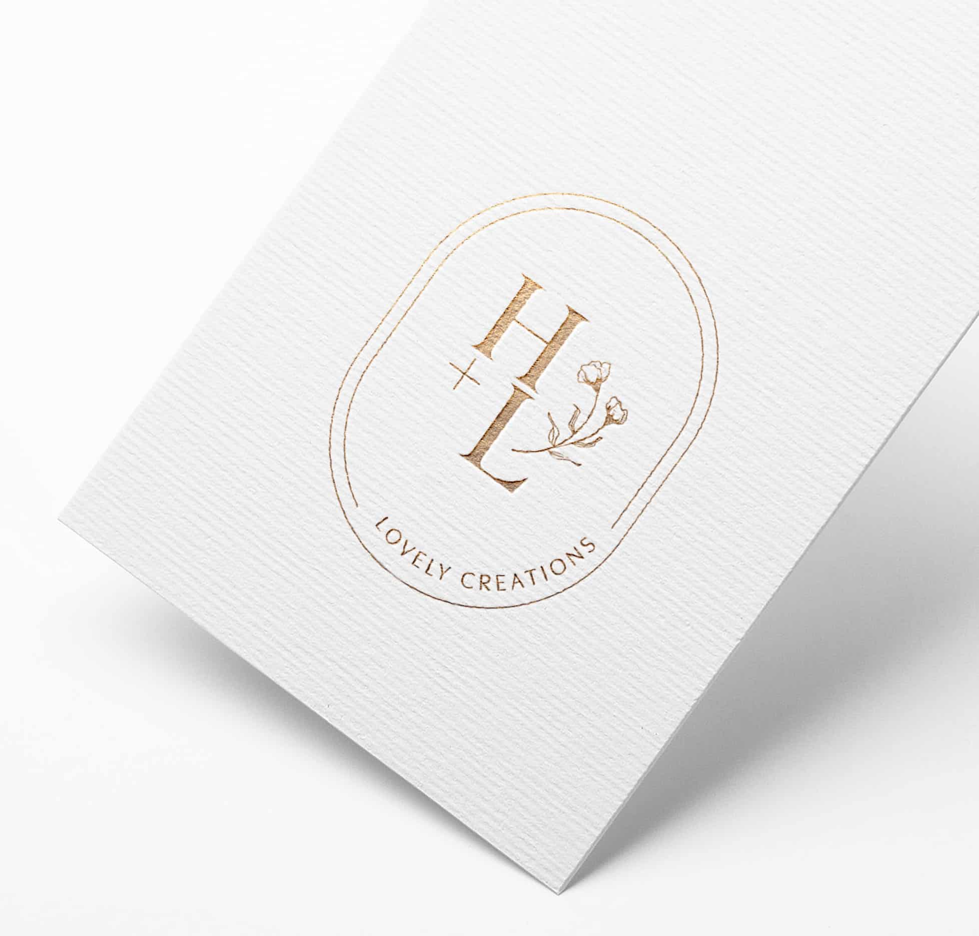
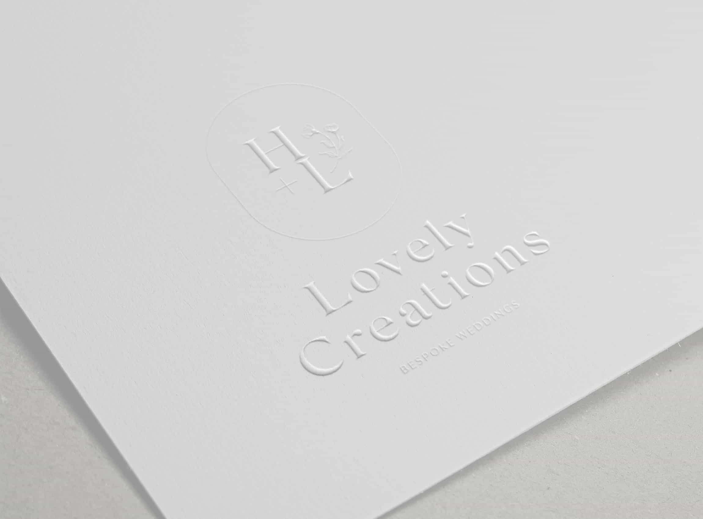
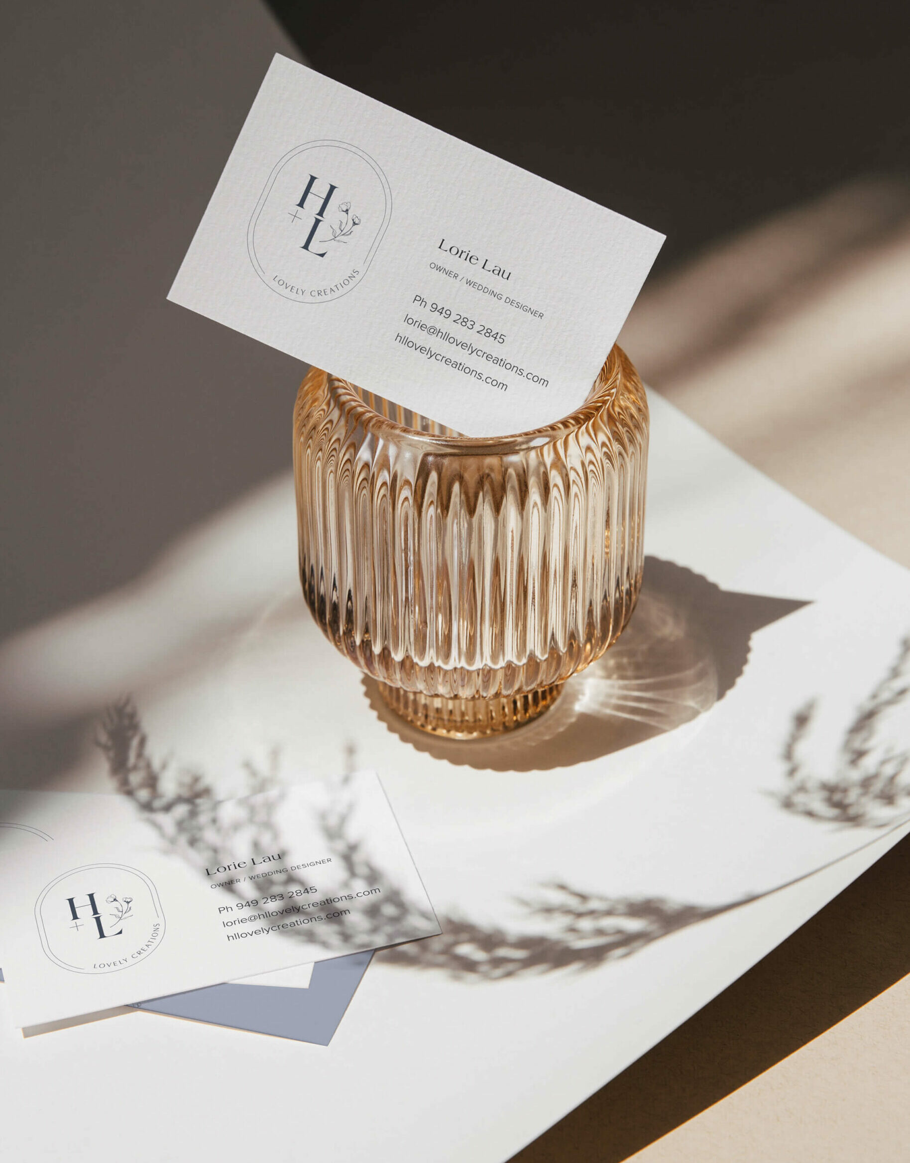
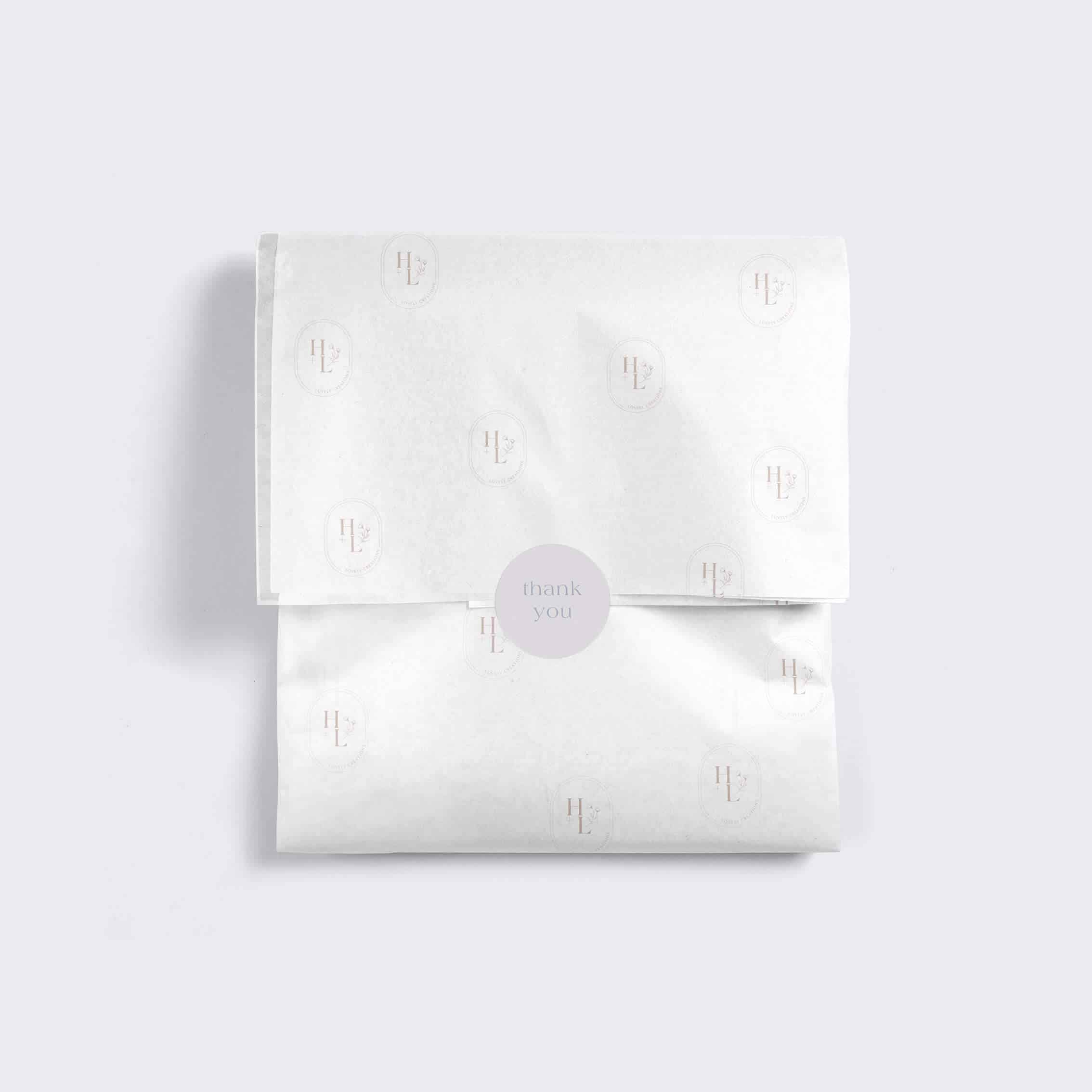
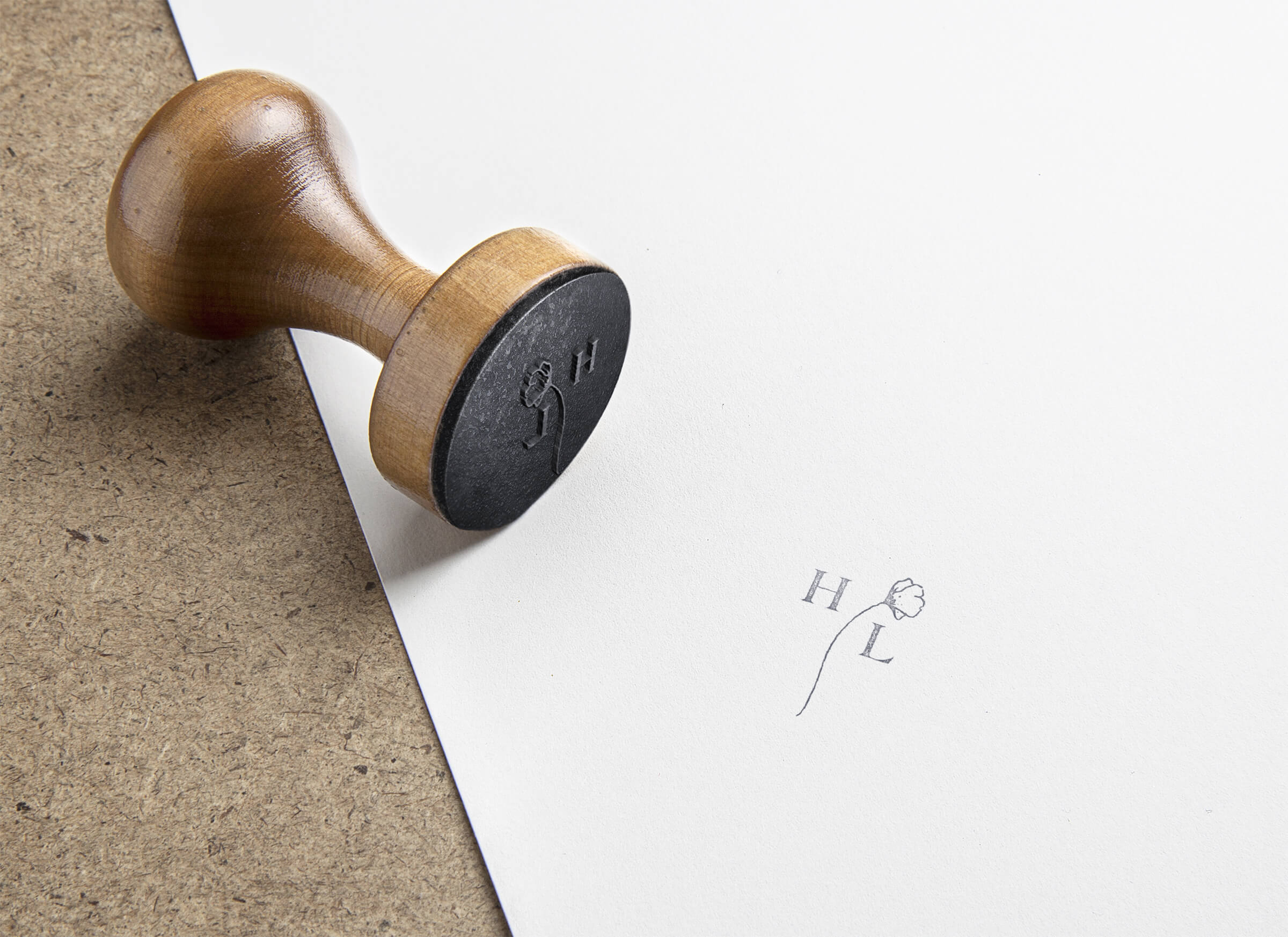
To reflect sophisticated and elegant, I see expensive textured stock with a touch of hand drawn details to give the brand that extra care and love. Ribbons, blind embossing can also bring this in.
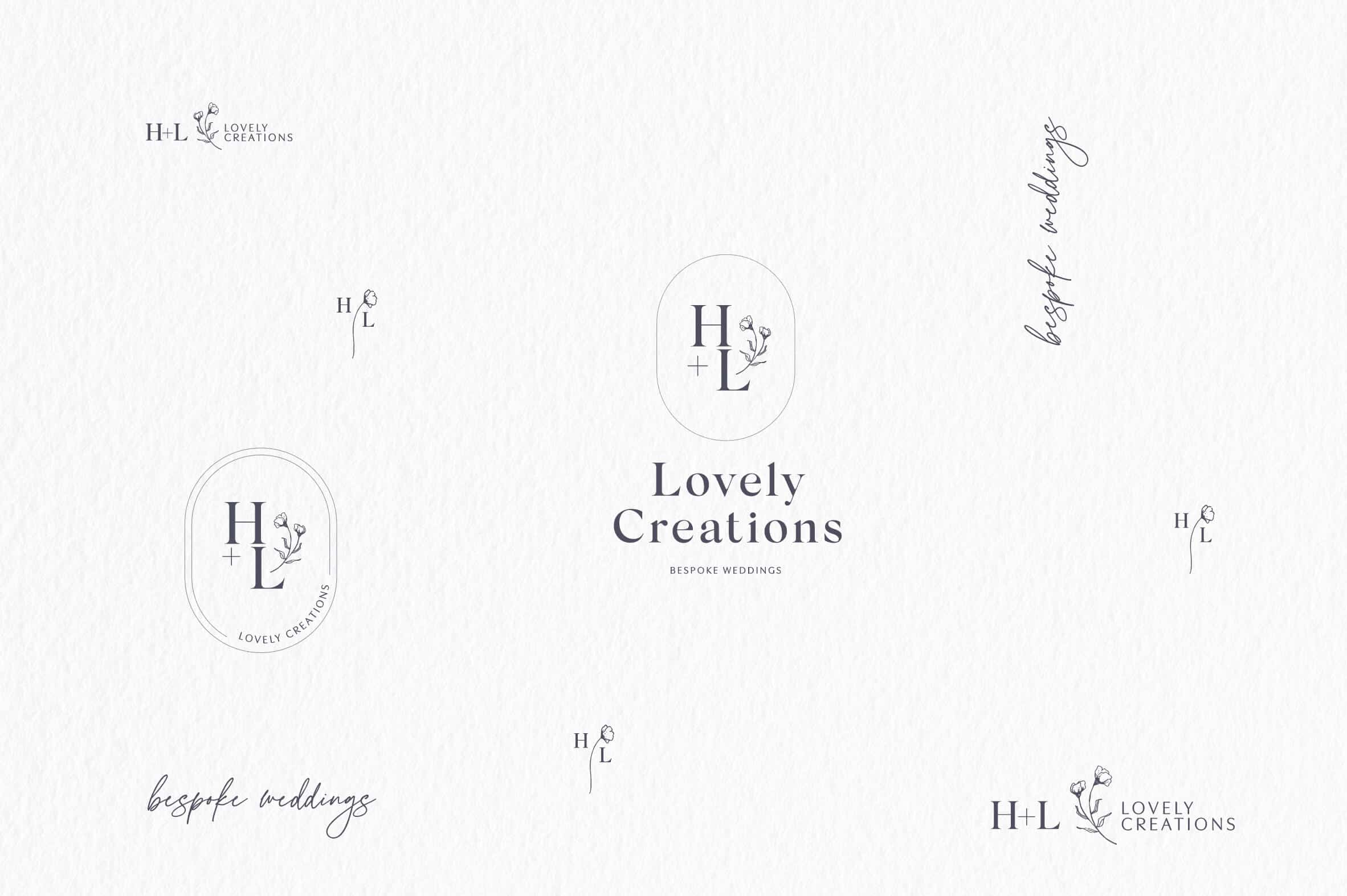
To give this beautiful brand impact and to bring in the high end look they are after, this has been done through the creation of the logo icon combined with elegant font choices and plenty of white space.
Note: This brand has soul and heart in it and this can be further entwined through their photographs and copy.
REFINED
This can be reflected in all the delicate details and plenty of elegant spacing but also brought through traditional, elegant serif font choices.
Color selections are also key in contributing to a refined and elegant approach.
ROMANTIC
What wedding isn’t romantic right?! An expression of love, which is what this whole business is about, including the foundation of their business name.
Because this is such a foundational theme for this business I have prioritised it as a brand key word.
This will largely be brought in through their gorgeous photography but also in softer colour tones, the fine details of type and delicate lines.
Ready for CLARITY, STRATEGIC DIRECTION and BEAUTIFUL DESIGN
for your business?

