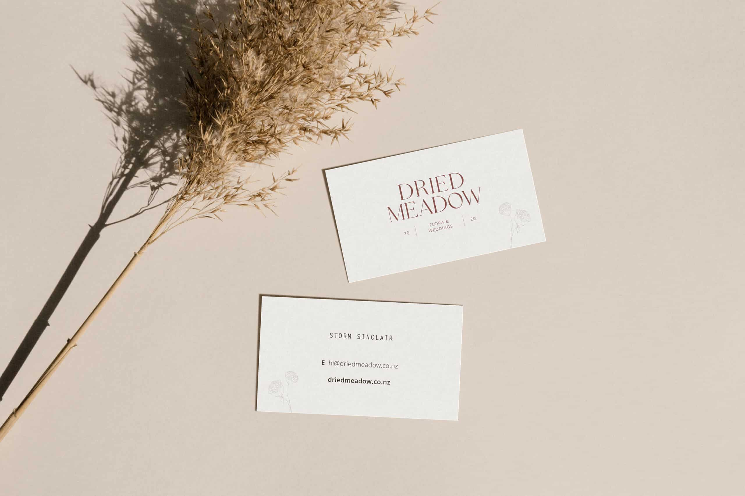
Dried Meadow
BRAND IDENTITY + SHOPIFY WEBSITE
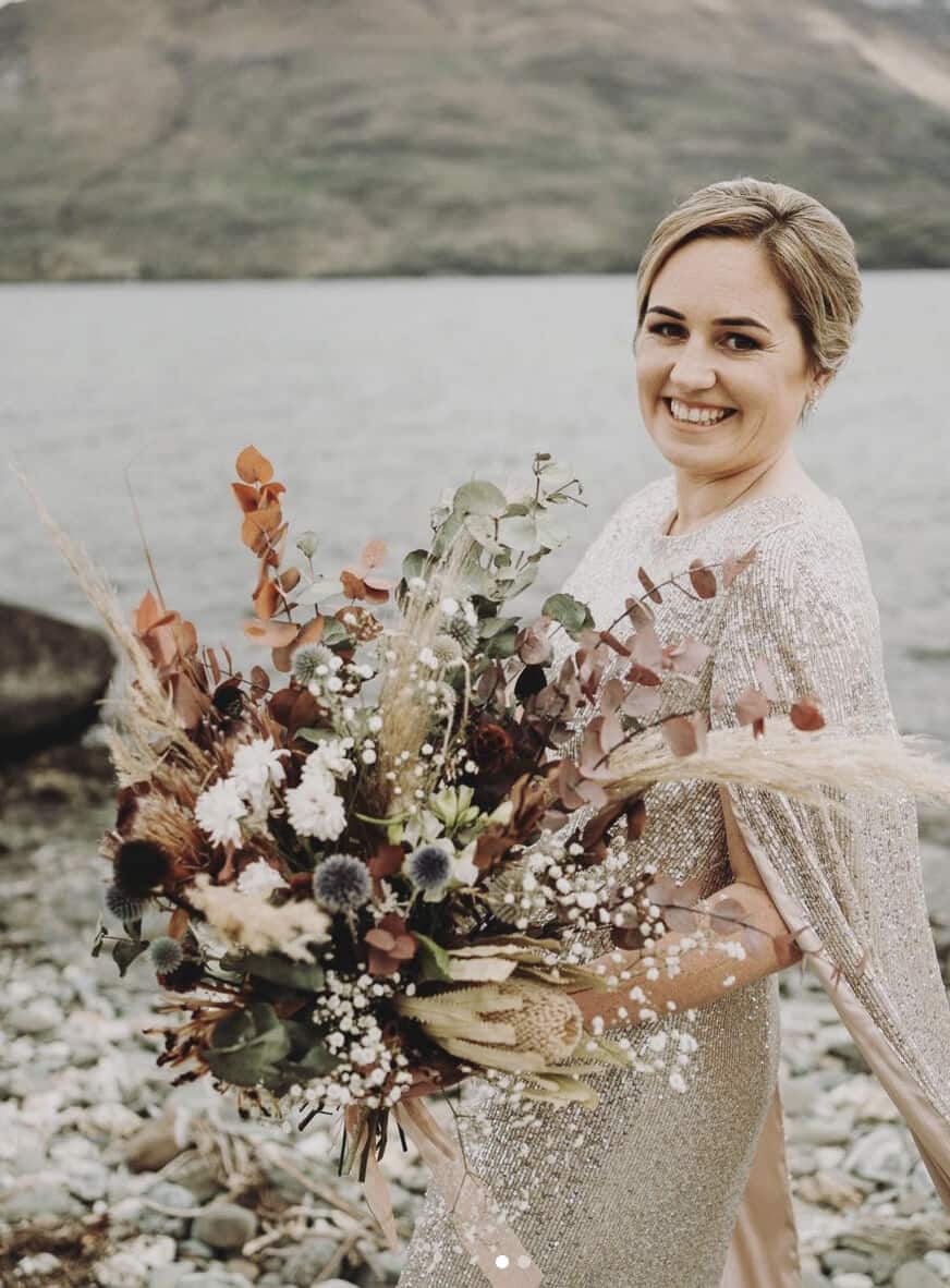
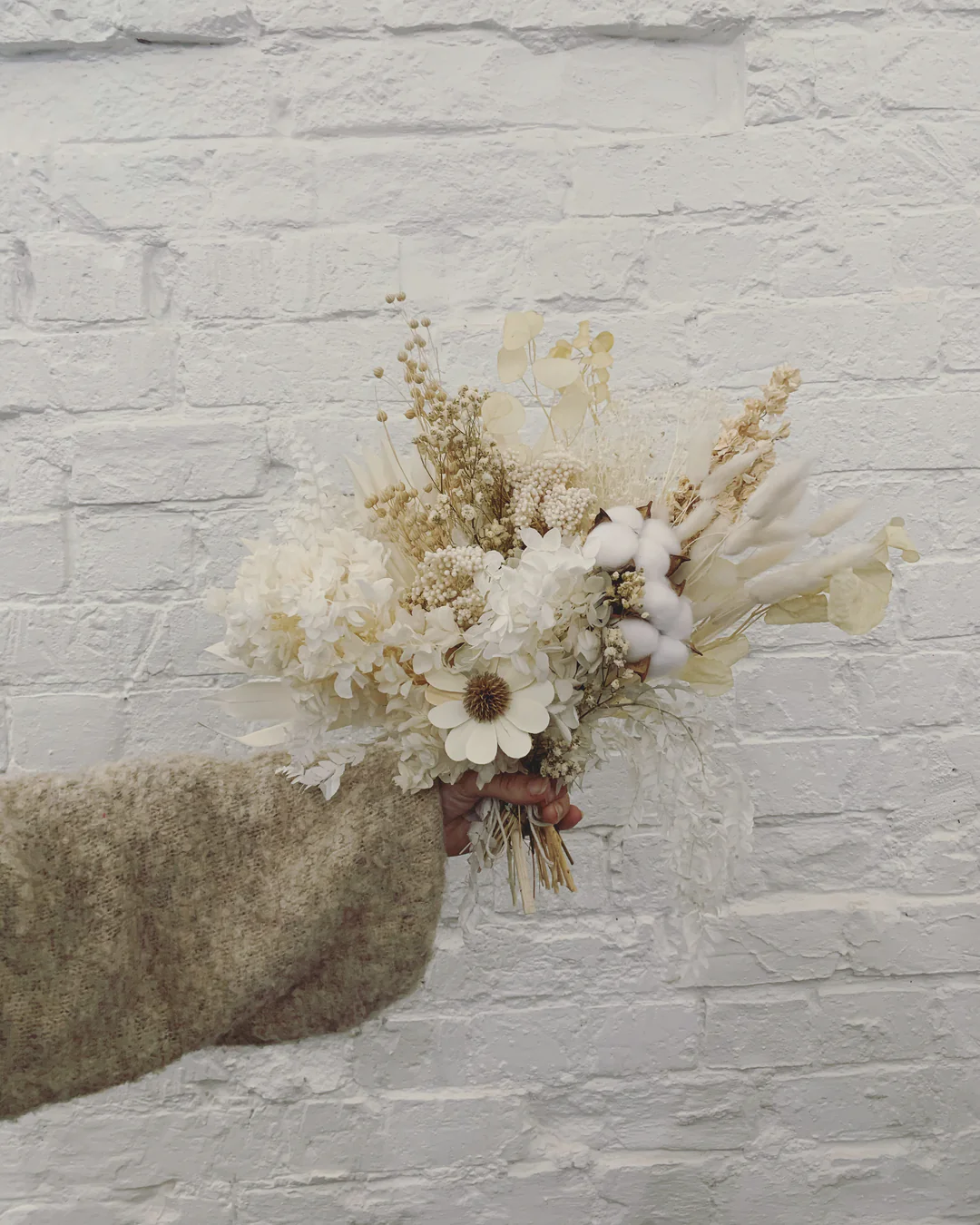
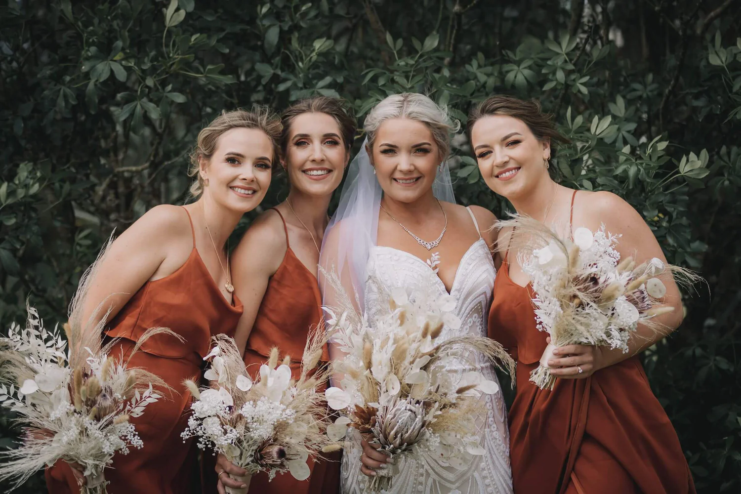
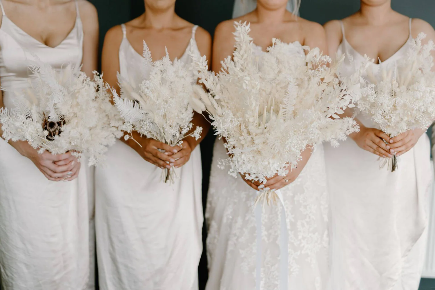
Dried Meadow, designs and hand crafts beautiful dried flower bouquets for gifts, homes and weddings. Storm Sinclair a passionate creative and now entrepreneur, began Dried Meadow in 2020 amidst a pandemic and lockdowns, during the last few years, Storm has grown the business extensively.
Having outgrown their previous start up logo, the challenge was to also create a new brand identity that encompasses their product range as well as their specialised wedding services whilst reflecting their unique business essence and values.
modern + boho + hand crafted + bespoke
Chrystal is fantastic at her job and asks all the right questions you wouldn’t think of ... Chrystal’s communication is fantastic. Her talk though videos are a cherry on the top! Thanks so much Chrystal 🙂 I would definitely recommend anyone to go through Indigo Ink!"
COLOUR PSYCHOLOGY
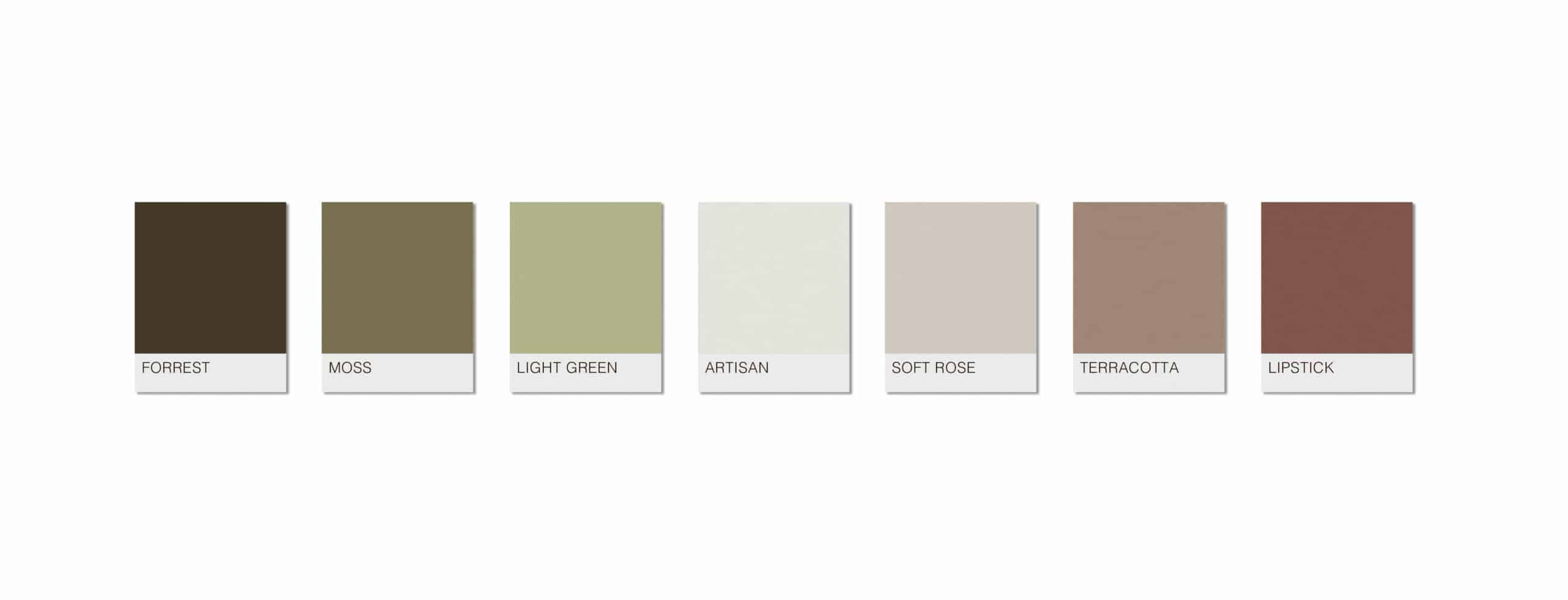
Dried Meadow sits primarily within the Summer season (colour psychology) from attributes such as aspirational, beautiful, calm, creative, ethereal, quality, romantic. With the Autumn season coming in second with attributes such as authentic, integrity, nature, warm, organic.
I haven’t used a solid black as I think it would be too harsh and unfriendly, when the bouquets have such beautiful textures and warmth to them. Instead I have used inspiring earthy tones, with a dark forrest green or the lipstick colour to provide contrast when impact is needed.
CREATIVE STRATEGY
MODERN
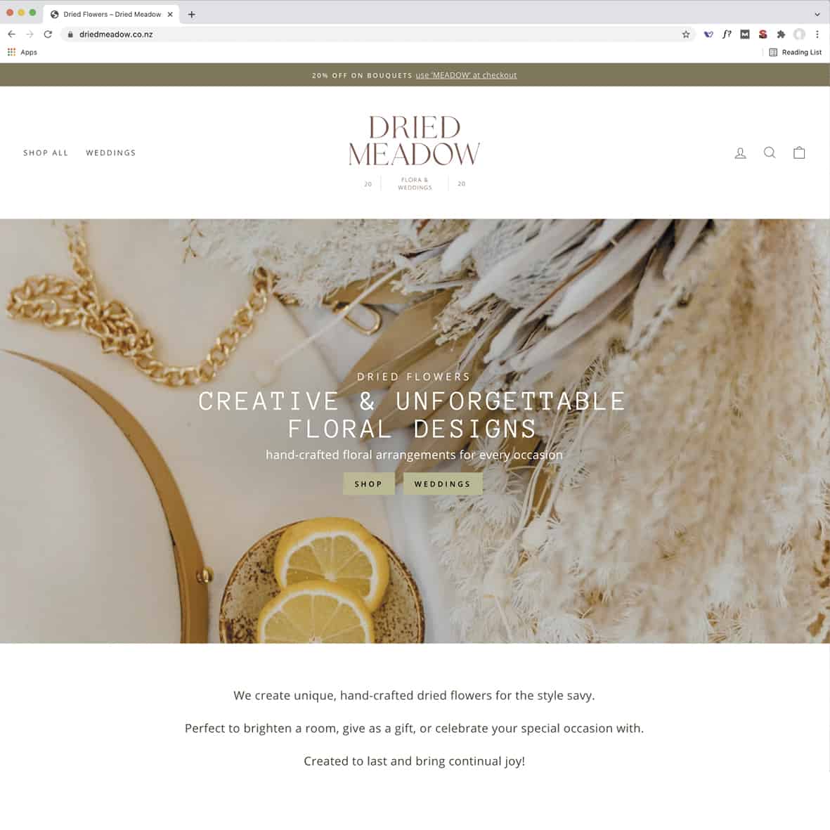
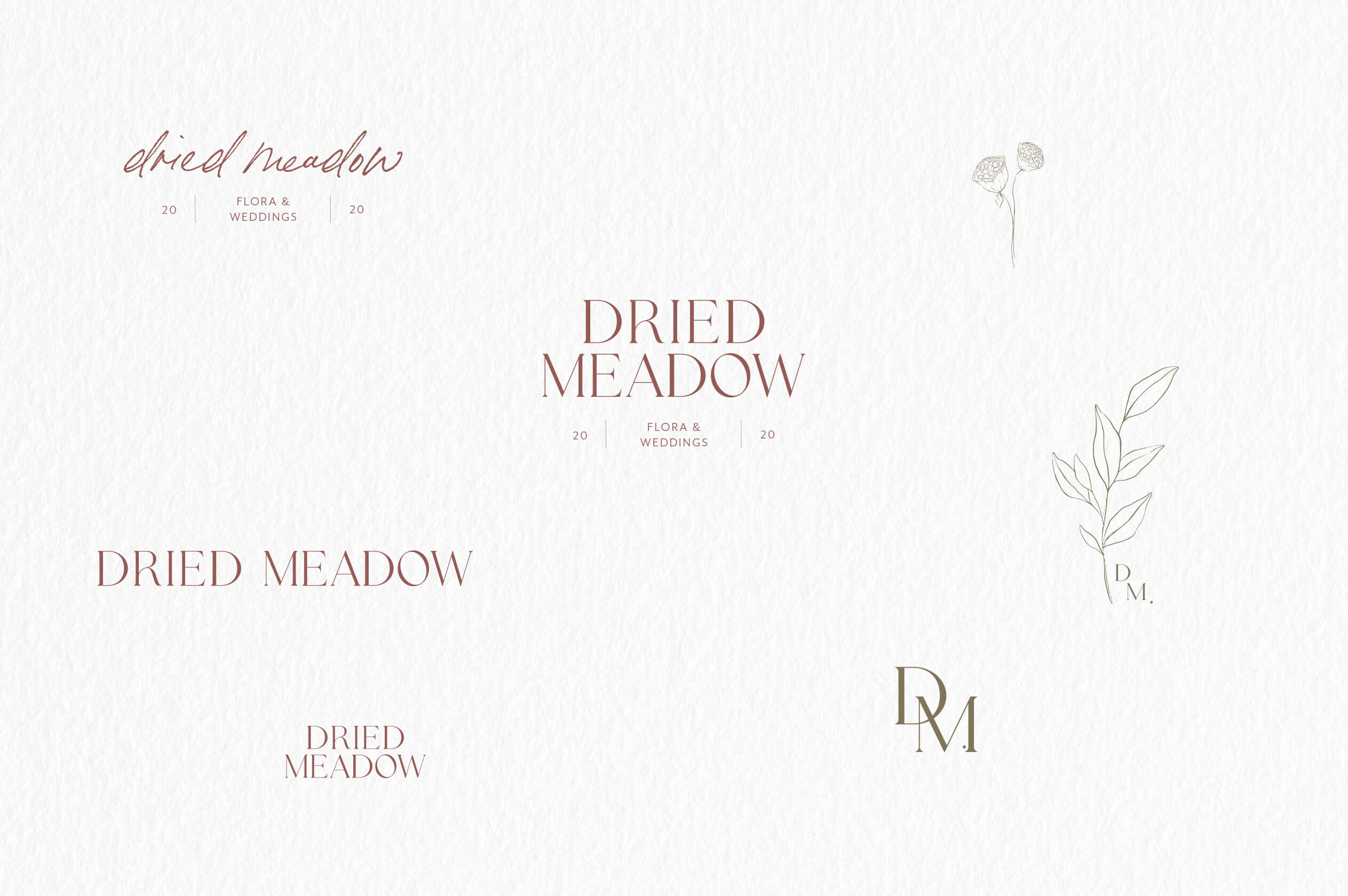
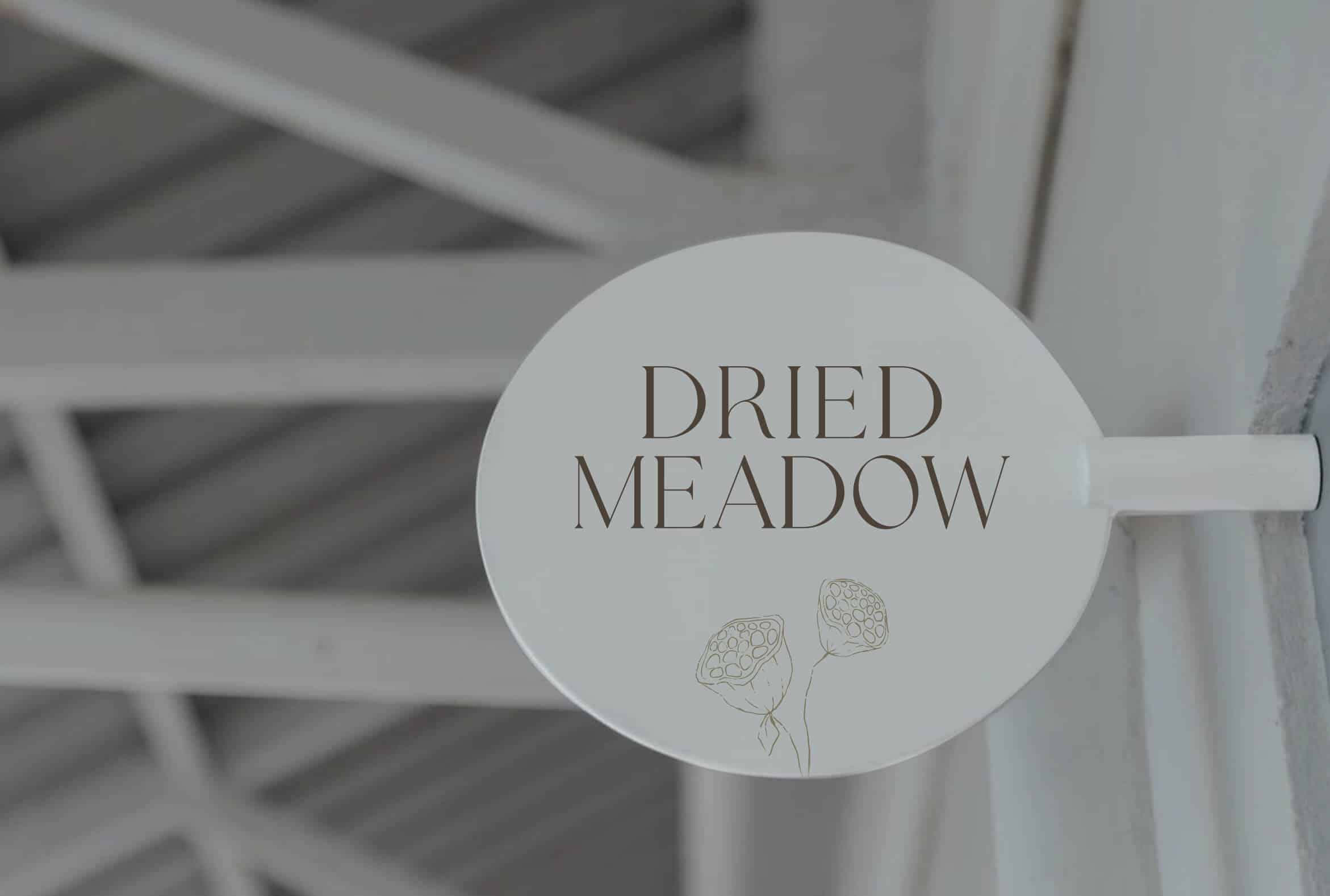
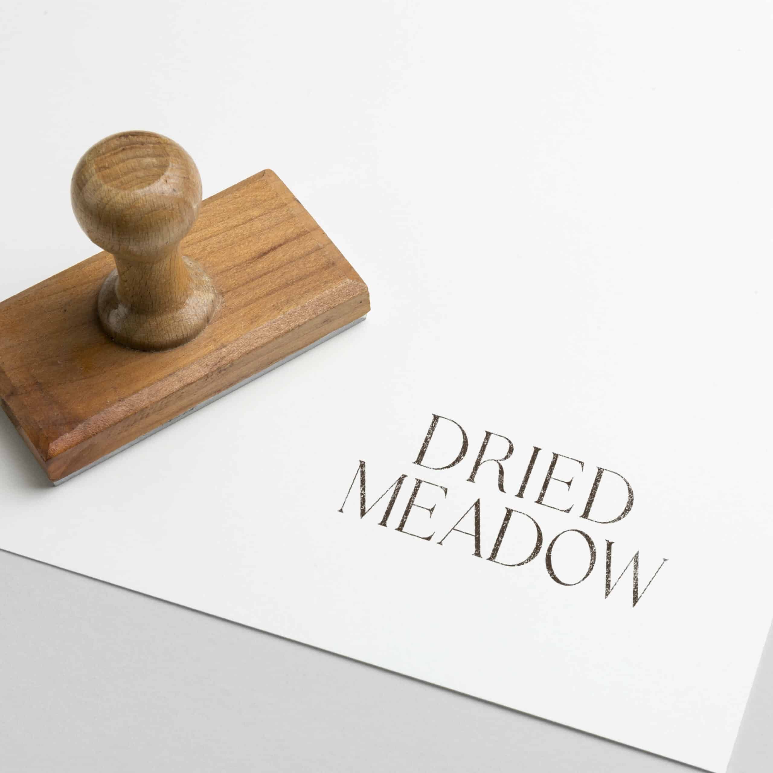
Modern and stylish is brought out in the branding through layout, keeping things clean and clear, along with a beautiful yet modern font. The serif parts add elegance to help Dried Meadow stand out from their competitors but also bring in the wedding vibe.
Colour selections also contribute to a stylish look, we have gone with some Summery tones drawn from your bouquets.
BOHO
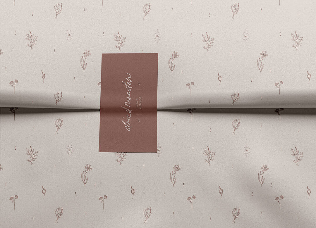
To bring in a boho, trendy, light hearted-ness and a little un-put-together-ness to reflect the hand-made element of Dried Meadow, I see some textures. This will help to tie in the modern, clean, professional aesthetic of the brand with the hand-made bouquets. Each flower is not the same as another, there are beautiful imperfections that need to be reflected in the brand identity as well. The illustrations used are illustrative of this and help to reflect the artistic, creative side of what Dried Meadow do.
HANDCRAFTED + BESPOKE
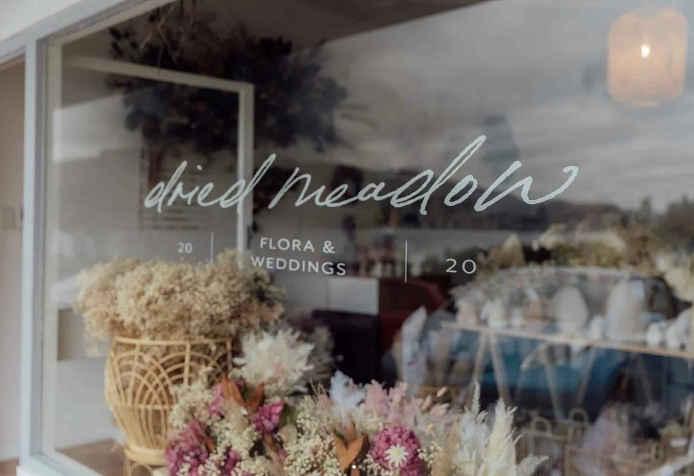
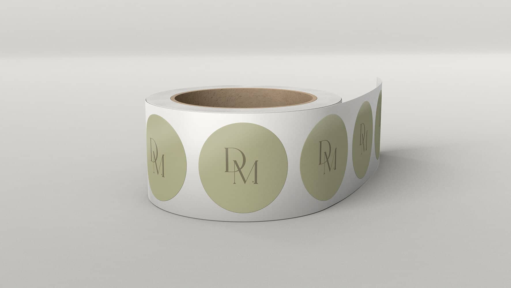
To reflect hand crafted, this will be seen through the illustration style – a touch of hand drawn details here and there, including the alternative main logo which features a handwriting style font. Packaging details such as ribbons, tissue paper and stickers will also help to pull this together and reflect the care that goes into creating the beautiful dried flower bouquets.
To give the Dried Meadow brand impact and to reflect the not-mass-produced value of the business, I see this translating through delicate lines, extra details, touches of rawness to edges, a slight unpolishedness
here and there.
Ready for CLARITY, STRATEGIC DIRECTION and BEAUTIFUL DESIGN
for your business?