Makeup Station
BRAND IDENTITY + WEBSITE DESIGN
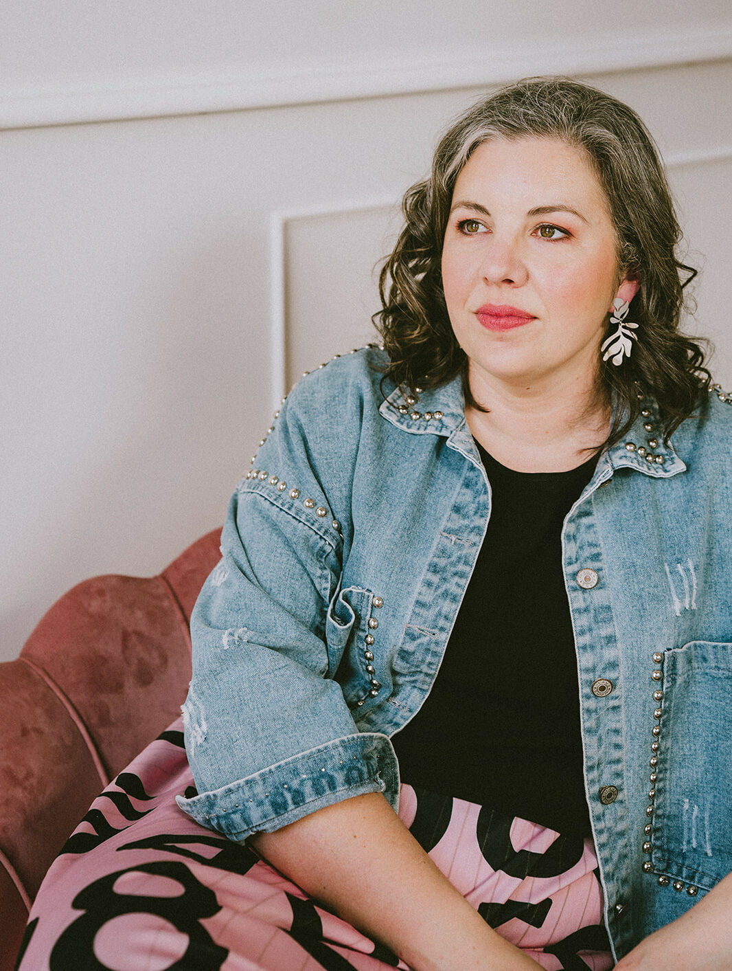
Makeup Station is an established business with a team of professional hair and makeup stylists. They specialise in making everyday women look and feel amazing for celebrations, including weddings.
Karina came to me having purchased the business several years back and now wanted to make some improvements. I love it when a client comes to me with such beautiful work I know instantly I can help them rebrand to uplevel their business image so it matches their higher quality of work.
elegant + timeless + approachable

COLOUR PSYCHOLOGY
Makeup Station has lovely Summer (colour psychology) attributes such as attention to detail, beautiful, calm, dependable, elegant, graceful, professional, soft and timeless.
The use of a solid black would be too heavy and oppressive, and would not suit because Makeup Station specifically want to be approachable and welcoming to all. Instead I have used a gorgeous charcoal for when we need a little more impact or some contrast. This is combined with softer tones to reflect the Summer aspects from above but also keep it fairly neutral to let your gorgeous photos of your work shine.
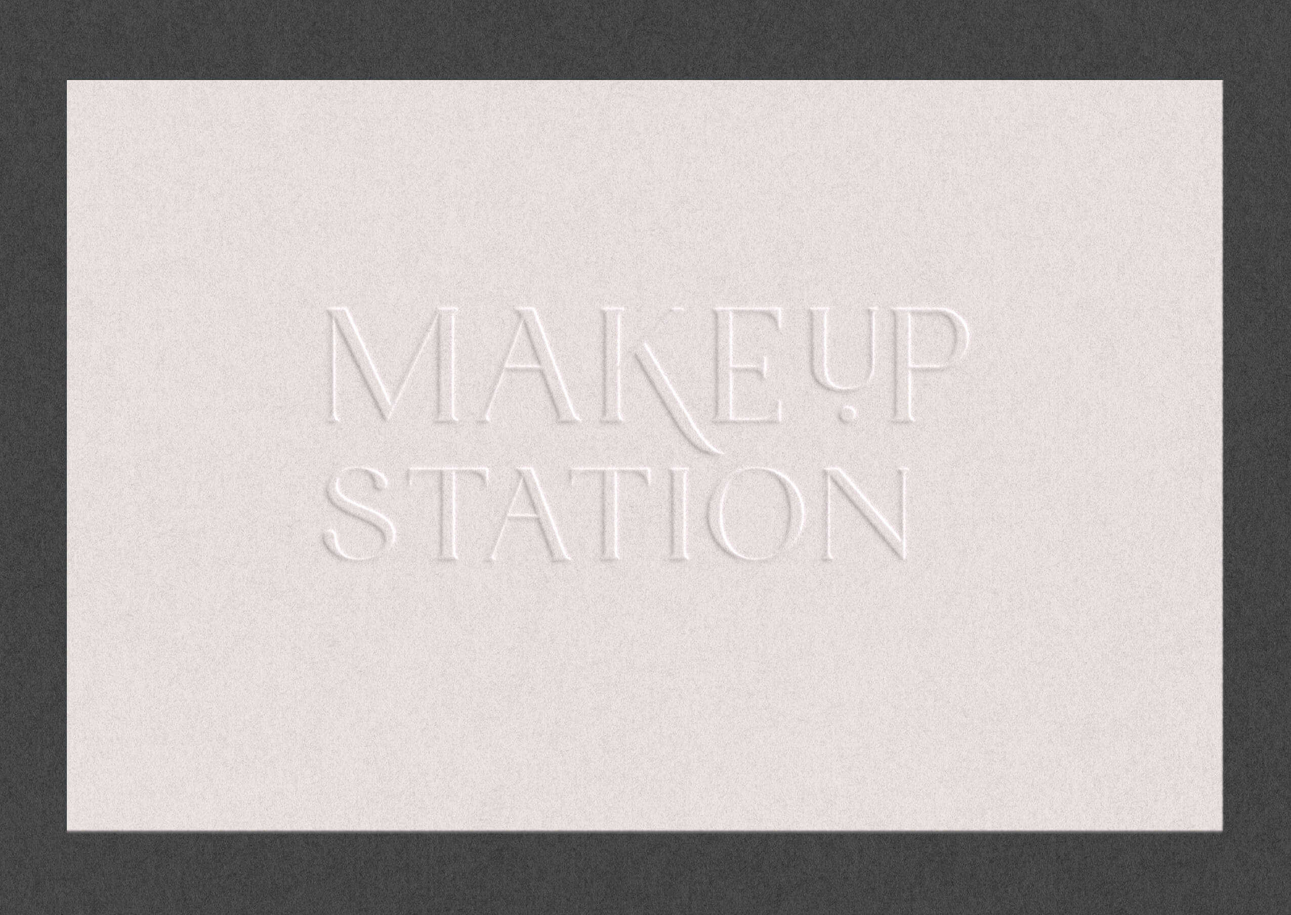
For print treatments we can look at subtle textures in stock, blind embossing or letterpress – those distinctive details to elevate your brand but keep it timeless and not looking too expensive.
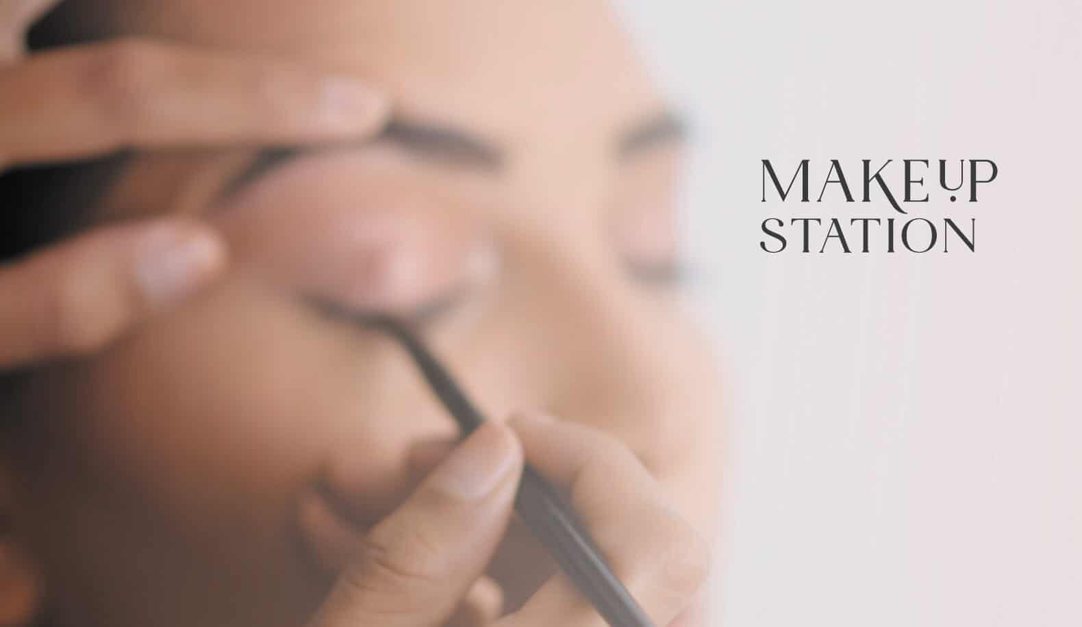
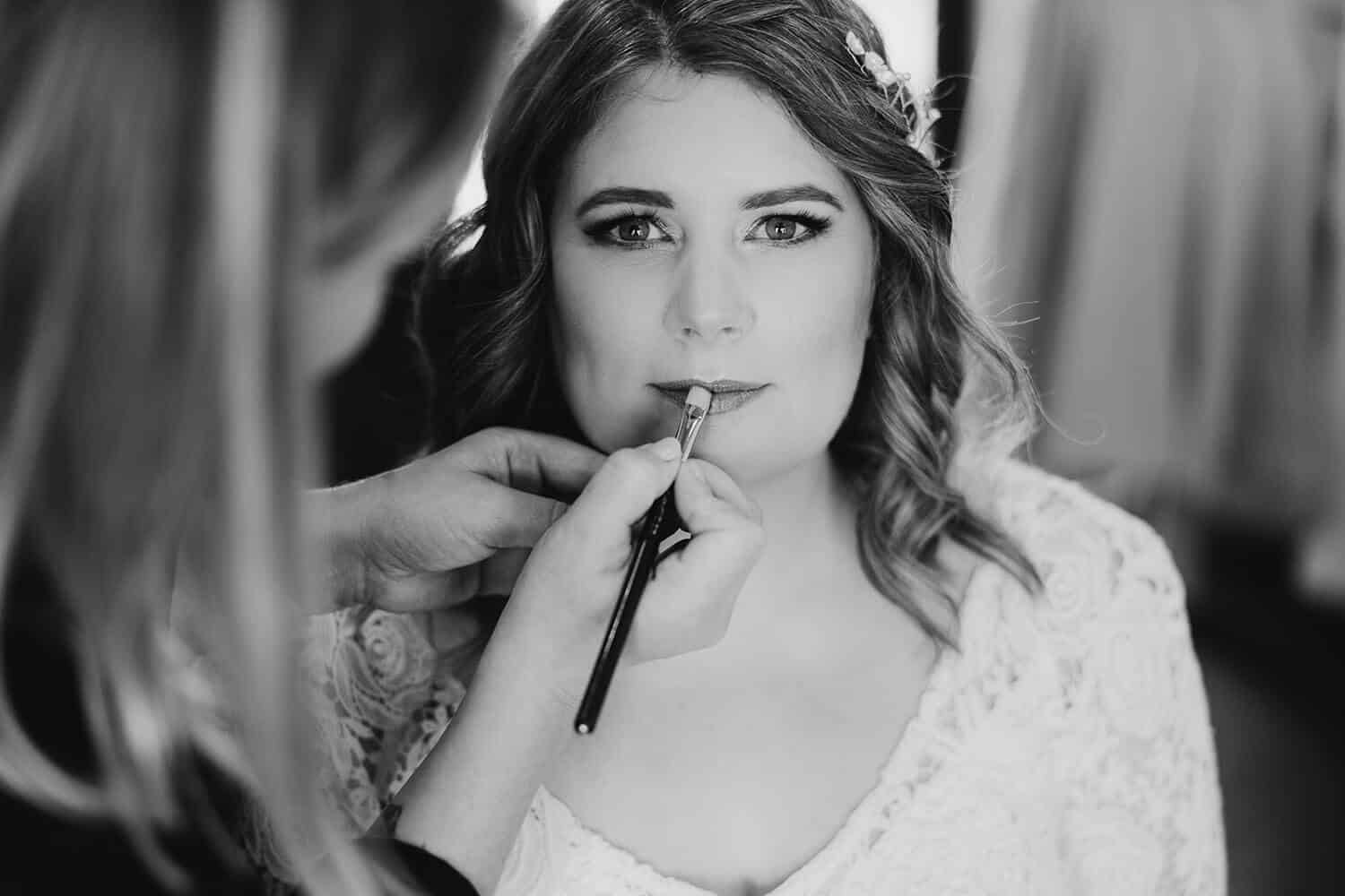
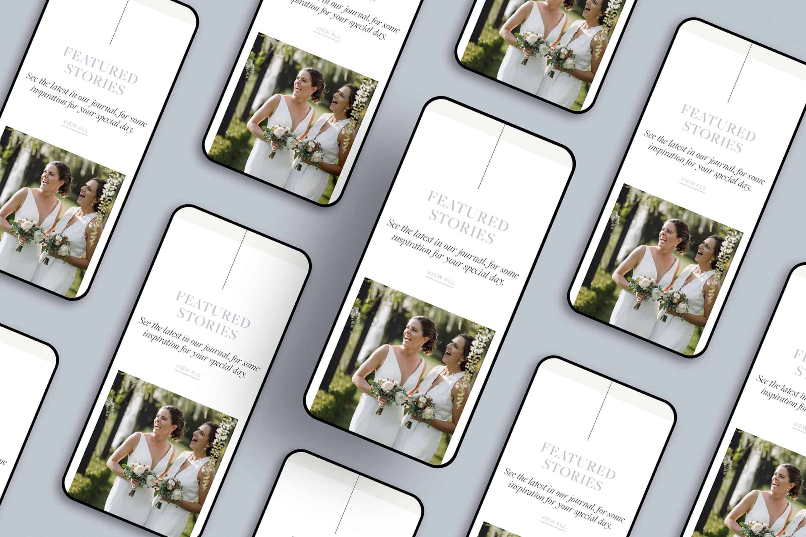
Photography style will be refined, understated, natural and low contrast.
CREATIVE STRATEGY
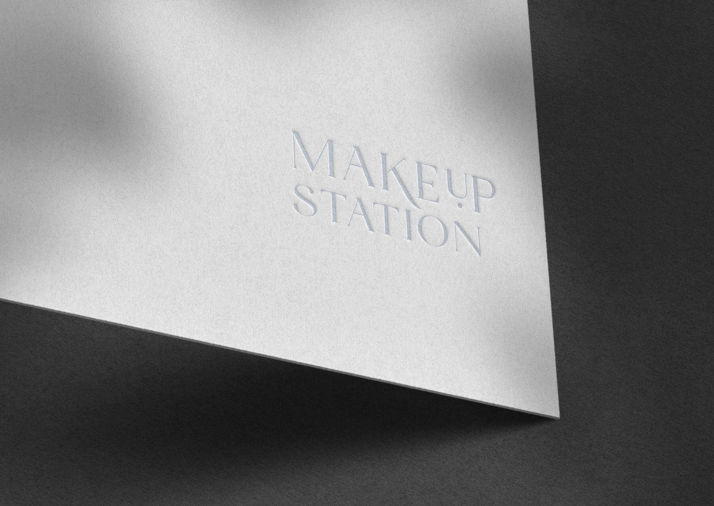
TIMELESS
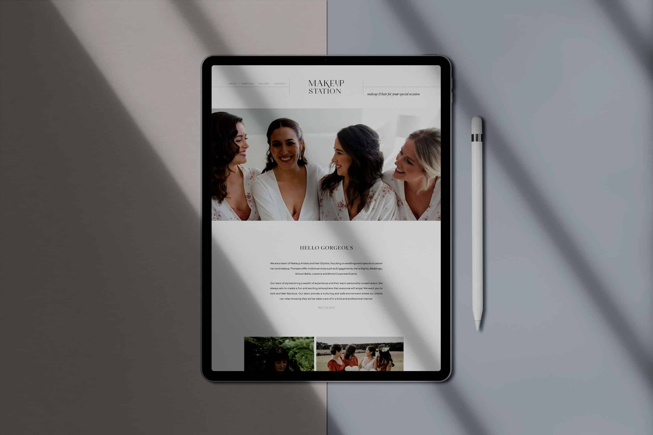
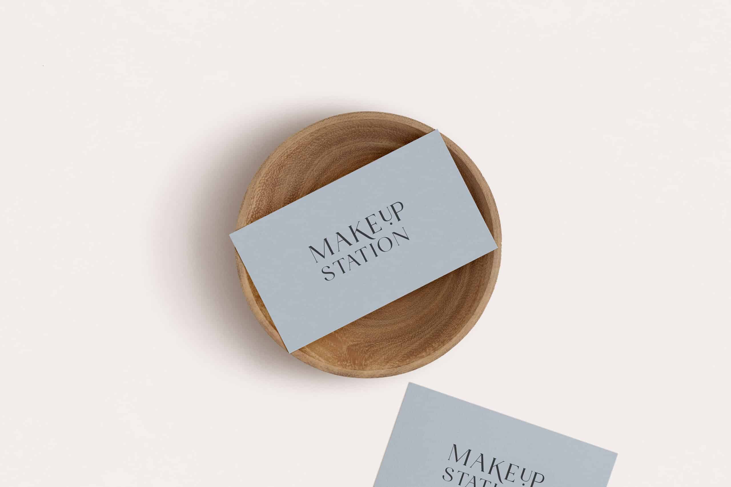
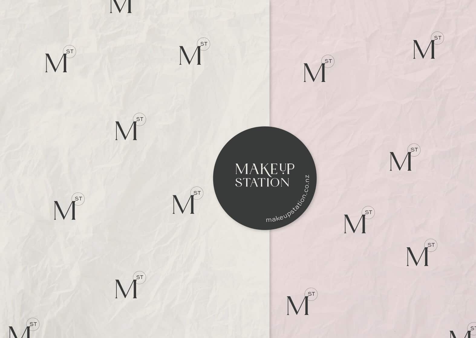
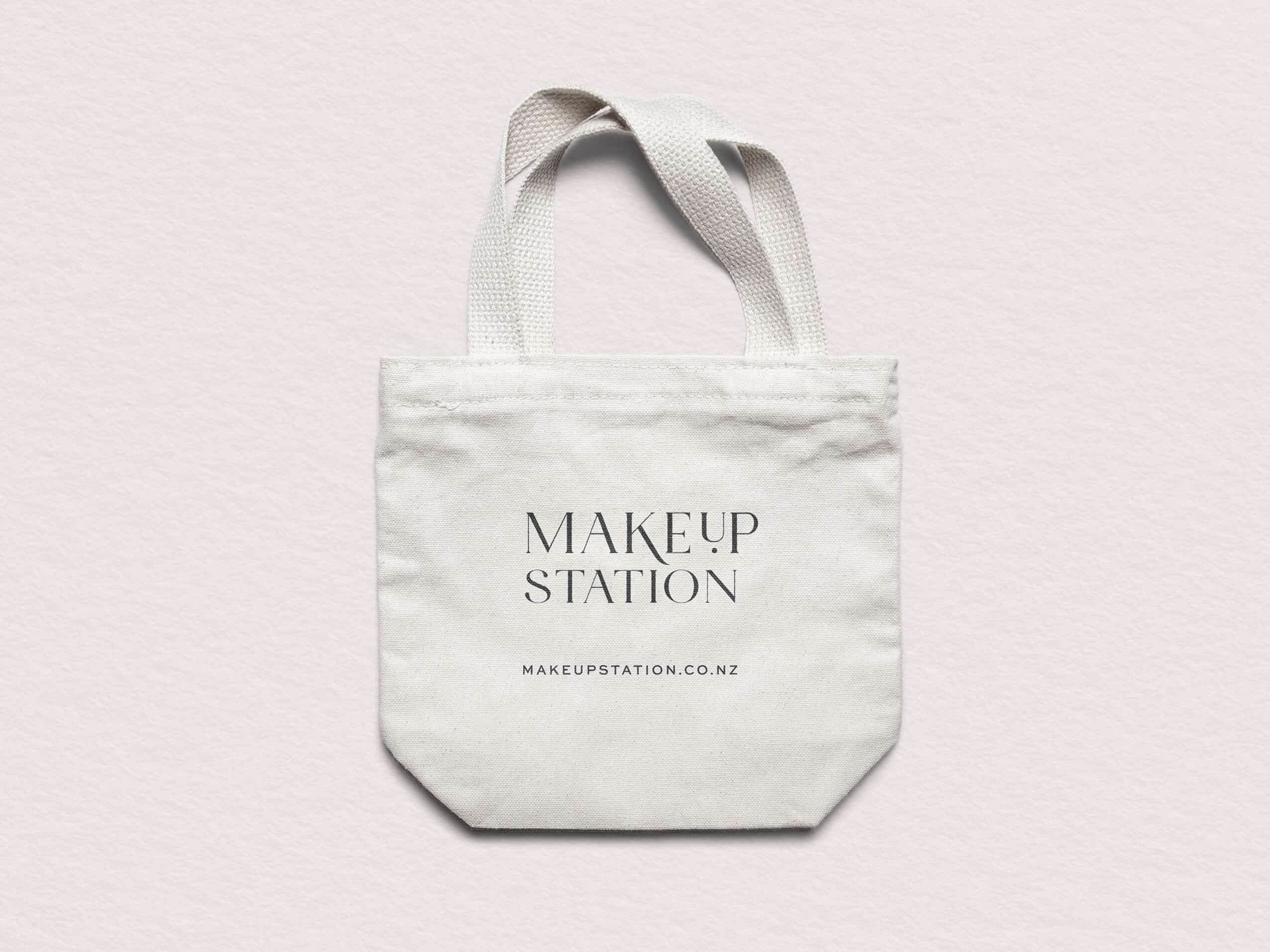
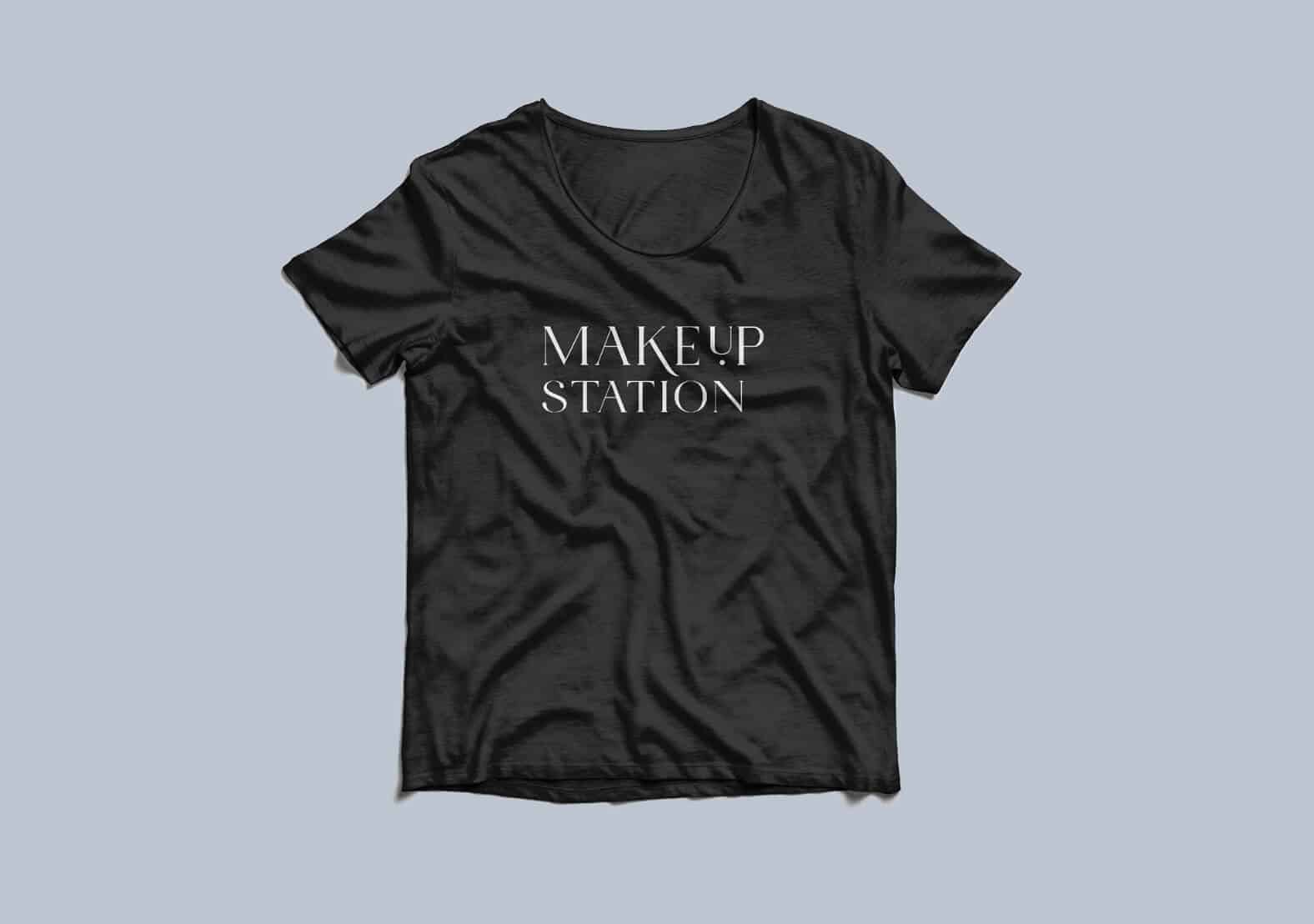
To give this brand the timeless yet modern feel it requires, I have utilised a stylish yet simple logo. The use of serif fonts for the logo along with a modern twist, to give it longevity and reflect the experienced team and well established business.
Staying clear of trends will help contribute to a timeless elegant look. The right use of space will help give this longevity as well.
ELEGANT
This is reflected in all the delicate details and plenty of elegant spacing but also brought through in traditional, elegant serif font choices for the logo.
Colour selections are also key in contributing to a elegant approach, such as soft pastel hues.
APPROACHABLE
To keep the branding approachable and welcoming I suggested using friendly and more casual wording throughout the website and marketing material.
We can also use colours and fonts to back this up, keeping things light and fresh and not too dark
and heavy.
Lots of photos of real people, will help to bring in the welcoming and approachable vibe. People buy from people.
Ready for CLARITY, STRATEGIC DIRECTION and BEAUTIFUL DESIGN
for your business?